By Justin Khoo
It looks like the folks at Yahoo! Mail are responsive (pun intended) to the email design and developer community. Less than a month after the petition for Yahoo! Mail to fix their CSS parser that causes emails with media queries to break, they have put in a fix for it.
This is SERIOUSLY great news. Thank you Team Yahoo! Mail!
What This Means
All the hacks you had to add to your styles within media queries so that they don’t “activate” in Yahoo! Mail are no longer needed. The Yahoo! Mail CSS parser now handles nested CSS blocks properly and styles within media queries remain enclosed after the parser is done with it.
Hacks that you no longer need to use in your email:
- Prevent Yahoo! Mail from displaying the mobile version of your email
(Attribute selector hack)
@media (...) {
  table[class=foo]{...}
}
- Stop Yahoo! Mail from Rendering Your Media Queries (Body attribute hack)
@media (...) {
  body[yahoo] .foo {...}
}
...
<body yahoo="fix">
Yahoo! Mail Web and Mobile App Is Now Responsive
An icing on the cake is that not only does Yahoo! Mail support media queries, the Yahoo! Mail mobile app does as well! Yahoo! Mail supports a limited set of media queries but most importantly the ubiquitous min-width and max-width filters.
So media queries such as these now work as designed in Yahoo! Mail and Yahoo! Mail app. (Note: Responsive content within Webmail will activate narrower than the max-width due to the 190px wide left navigation bar).
@media only screen and (max-width: 480px)  {
  img { width: 100%; }
}
However, max-device-width, min-device-width, -webkit-min-device-pixel-ratio are not supported. It appears media queries with more than one filter are not supported either.
@media screen and (min-width:321px) and (max-width:768px){
  img { width: 100%;}
}
becomes:
@media screen and (min-width:321px)and ( _filtered_a ){
 #yiv6584440300 img{ width:100%; }
}
Yahoo! Mail Client Targeting
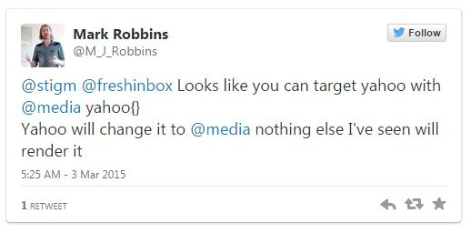
Mark Robbins (@m_j_robbins) of RebelMail also discovered a new way to target the Yahoo! Mail client. (Unfortunately, it appears this technique doesn’t work in IE10/11)

You can put CSS specifically for Yahoo! Mail like the example below and it will only be activated in Yahoo! Mail and nowhere else. (Use at your own risk ☺ )
@media (...) {
  body[yahoo] .foo {...}
}
...
<body yahoo="fix">
Test Your Existing Templates
This update may potentially affect templates that depended on Yahoo! Mail’s quirks, so I would run some tests through Yahoo! Mail to make sure everything’s A-OK. Hat tip to Stig Morten Myre for kicking off this discussion and for suggesting the petition on Yahoo! Mail’s forum.
Notice any new quirks? Pipe in in the comments below! The Litmus forum also has some interesting discussion.
Gmail, the ball’s in your court now. Time to support embedded styles and media queries!#CanHasStyle


